2021 - DR. MARTENS
DLV - Deutscher Ladenbau Verband
RETAIL DESIGN INTERNATIONAL Vol. 6 (2021),
av edition
Architizer
ARCHELLO
Archinect
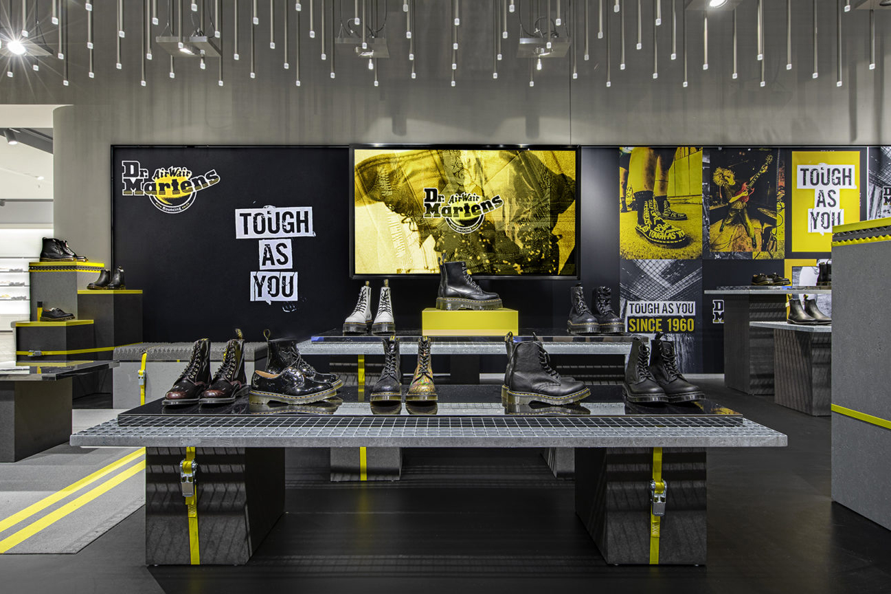
TOUGH AS YOU – DR. MARTENS POP-UP AT BREUNINGER STUTTGART
The briefing was to develop a concept and design for a temporary Pop Up. 20 Dr. Martens woman shoes have to be staged, using the „Tough As You“ campaign images and transporting the overall campaign idea aligned to the brand values in context of the sophisticated Breuninger audience.
An exclusive pop-up presentation in the shoe department of Breuninger Stuttgart was developed and executed for Dr. Martens‘ »Tough As You« campaign. To go with the campaign, the focus was on playing with rough elements which is why various materials were used for the surfaces, successfully combining the sophisticated store environment with pop-up elements. Eye-catching campaign assets were also brought into play, including printed material as well as the brand’s powerful »Tough As You« video as a digital component. The use of Dr. Martens‘ striking CI colours ensure an arresting presentation of the shoes. Thanks to the flexible elements, the pop-up will be ready to be used again at other locations (e.g. PopUp @ KaDeWe Berlin).
retail & furniture design, execution planning
©️ a project with DFROST Retail Identity






MATERIALS
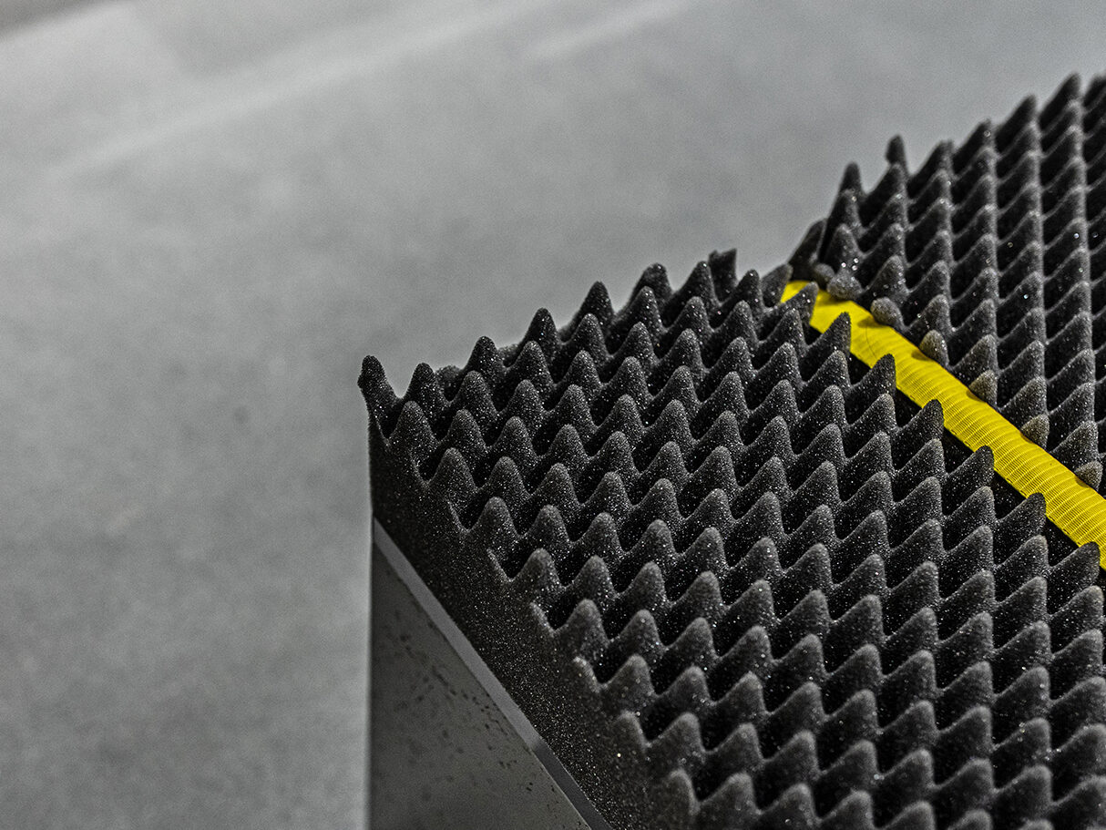
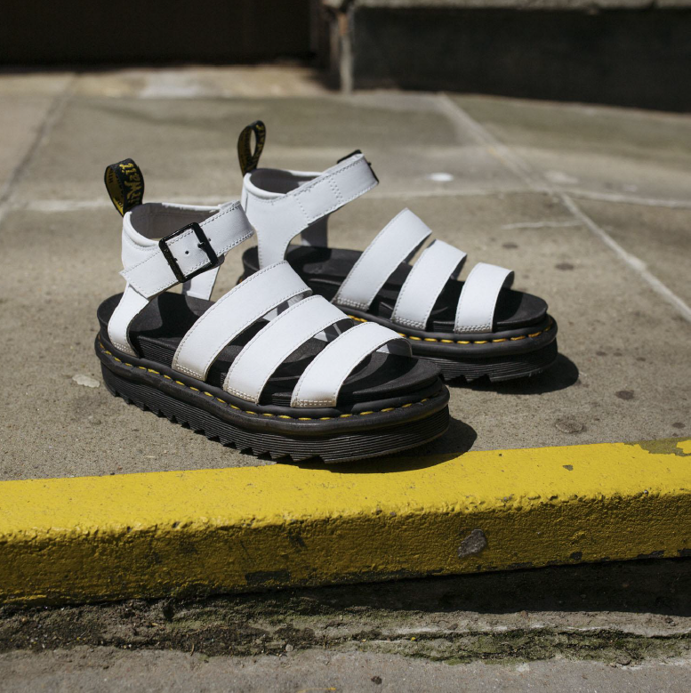
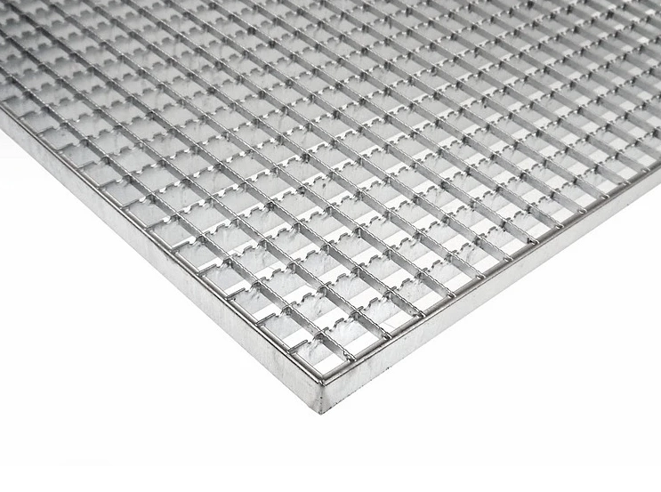
Rough materials are combined with premium appeal and elements which have a connection to music, derived from the Dr. Martens campaign „Tough As You“.
»A (MUSICAL) PROTEST«
The brand has a strong connection to music and culture in general. By using rough materials in combination with an improvised music studio aesthetic we want to express the campaign values, highlight the brand’s roots and underline the loud attitude in a subtle and contemporary cool environment.

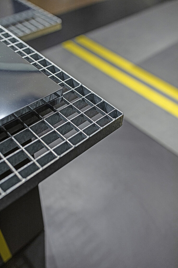
DETAILS
The choice of extraordinary materials transports the rebellious Dr. Martens spirit.
SEATING FURNITURE
Acoustic foam is used as upholstery and serves as a haptic customer attraction.
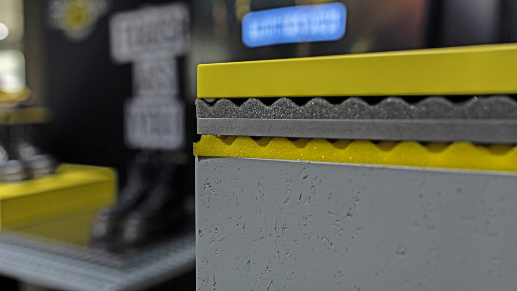
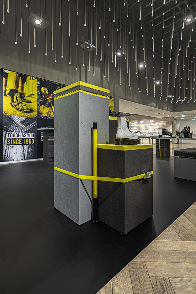
HIGHLIGHT FURNITURE
In contrast to the horizontal „table“ presentation, two highlight points with more of a vertical orientation have been developed, including elements in Dr. Martens‘ brand colour yellow.